Style Guide
Brand architecture was necessary to create hierarchy to the structure of the platform. It eases navigation and provides orientation to users which is explained further under Navigation.
The brand architecture of DnA. The simple geometry for the rectangle is easily adaptable to all the different service names offered within DnA.
Like any band, guides for color, type, illustration style, and photo style were established. With a such a massive platform of different services, it was important to establish a foundation to serve as a guide in unifying the look, feel, and voice of DnA.

The established color guide makes judicial use of highlight colors in overall layouts and illustrations.

Avenir Next is the official typeface of NYC Health + Hospitals. It was sensible to adapt it to DnA to keep the brand connected to NYC Health + Hospitals.

Illustration examples
Some examples from the standardized icon library
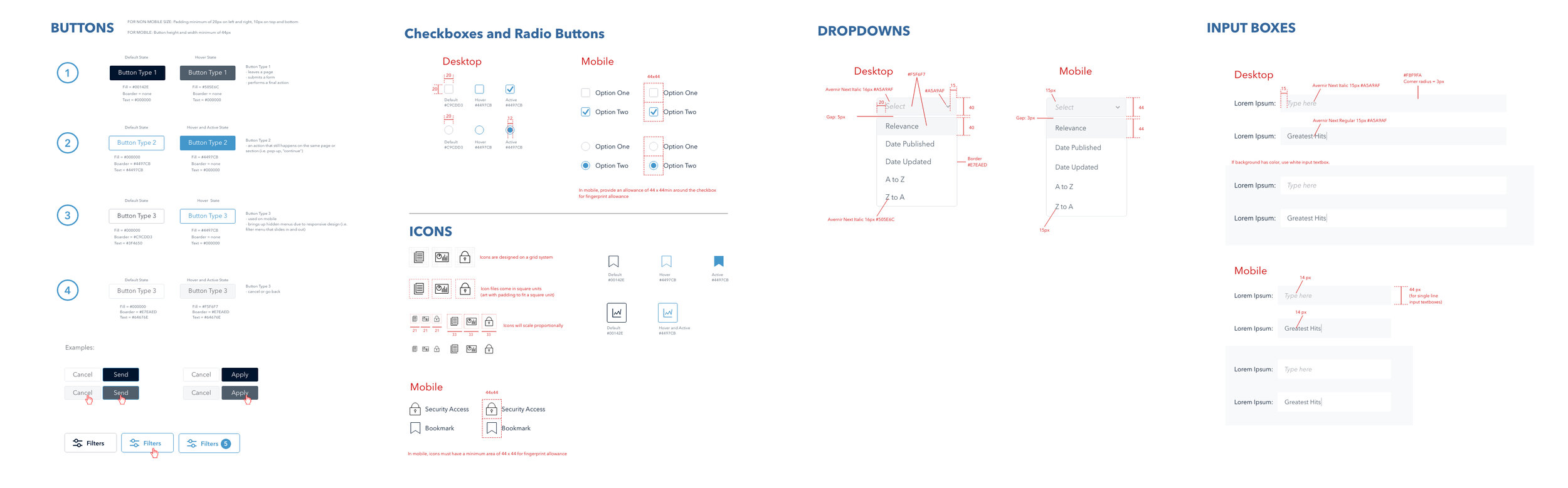
Excerpts from the style guide for common interface elements